Road13
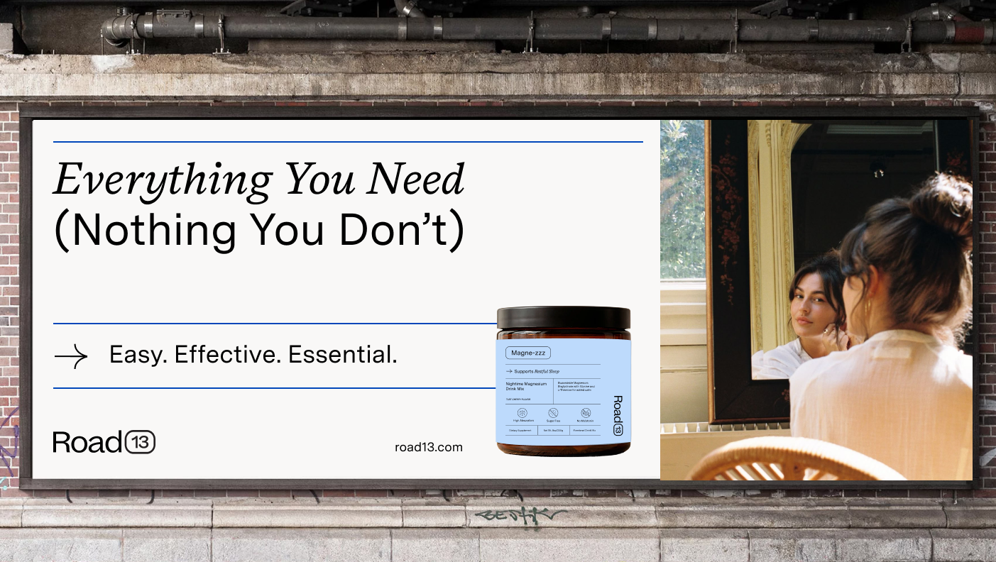
“Easy. Effective. Essential.”
OVERVIEW
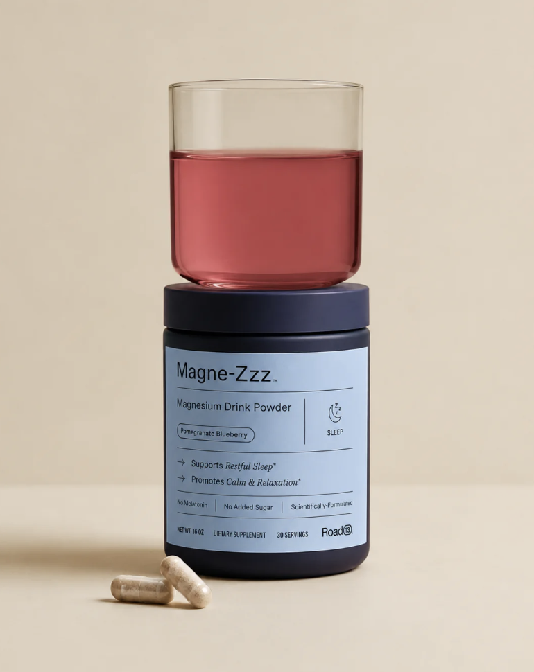
Road13 came to us with the idea for a single product: a magnesium powder called Magne-zzz. At the time, that name was intended to carry the entire company. But through deep-dive discovery and strategy, we uncovered something much bigger. This wasn’t simply a magnesium supplement. It was the beginning of an entirely new way to navigate wellness.
The challenge: create a supplement brand for the high-performing woman who deeply values her health, but doesn’t have hours to spend researching ingredients, decoding conflicting advice, or building an overly complicated routine. She wants to feel better, show up for herself and her family, and make informed choices, but the supplement category often creates more confusion than clarity.
We began by getting incredibly specific about who she was, what she was navigating, and what she actually needed from a wellness brand. What emerged was a clear opportunity: not another supplement company selling isolated solutions, but a simplified system for supporting a regulated life. One that could meet ambitious people where they are and make better health feel clear, achievable, and built for real life.
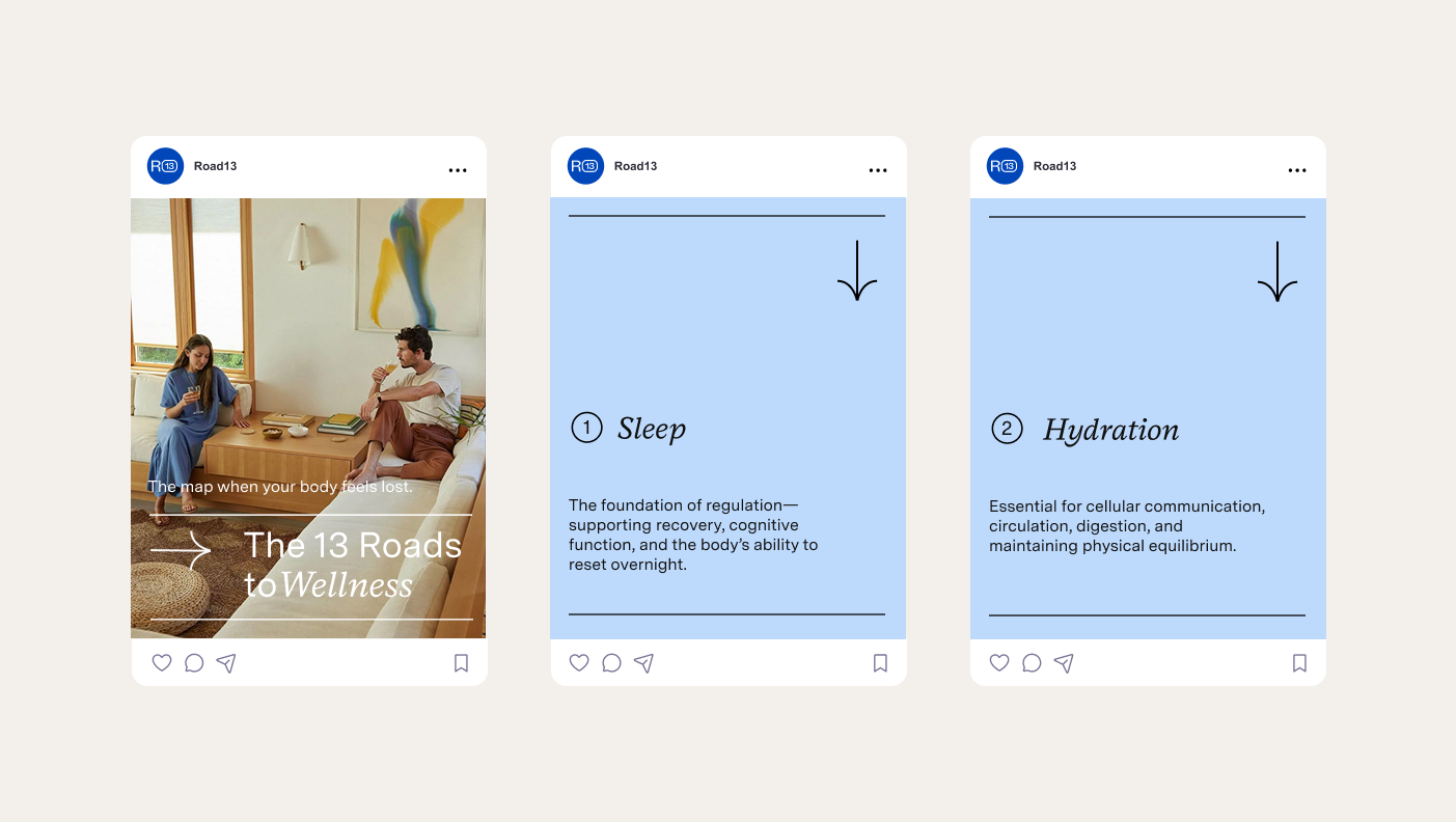
From there, we built Road13 from the ground up. We created the name, positioning, and philosophy behind the brand’s thirteen-road approach to wellness, transforming a single-product concept into an expandable system with a clear point of view and room to grow. Each road represents an essential pathway to wellbeing, giving customers a more intuitive way to understand what they need and why.
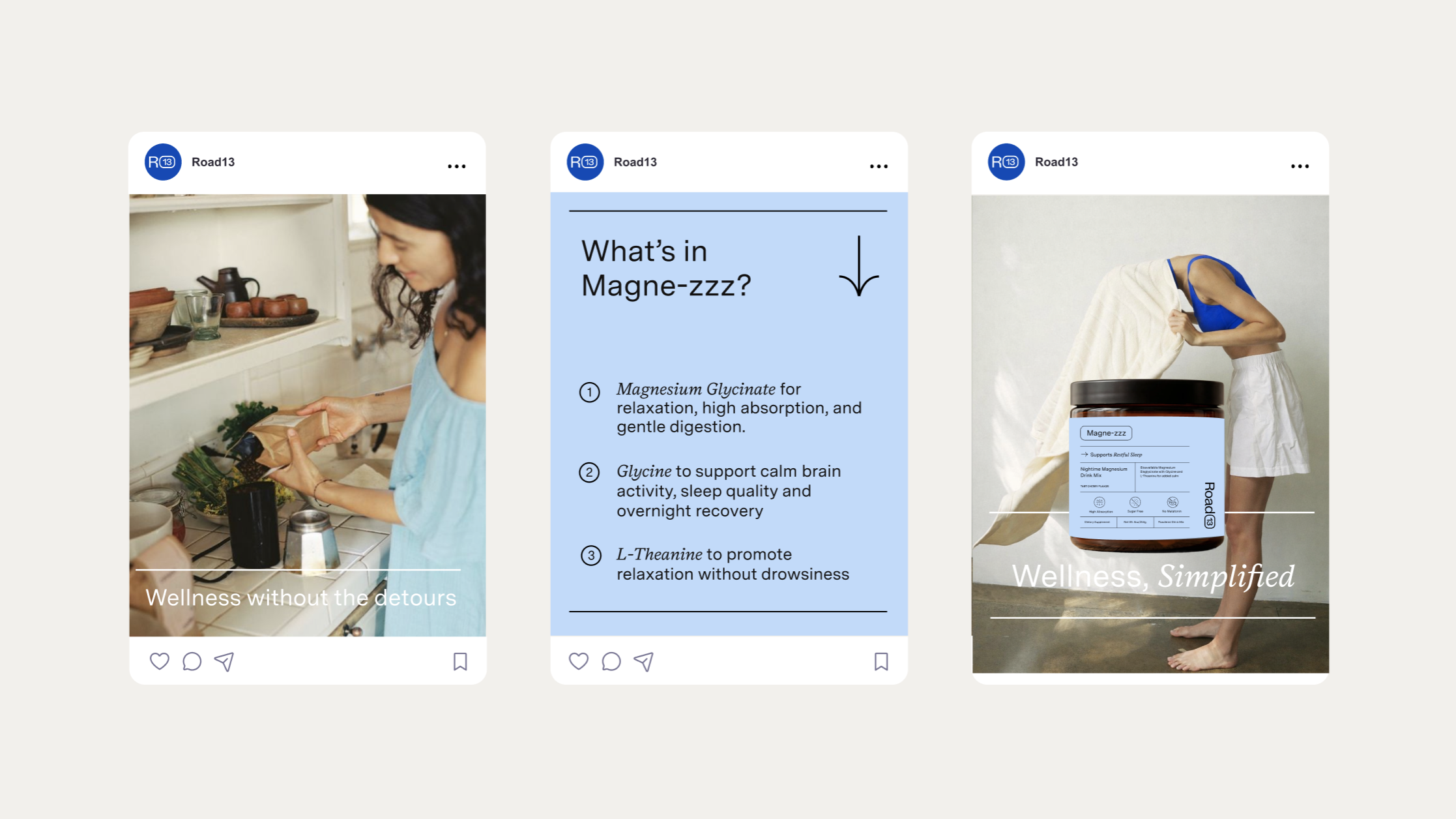
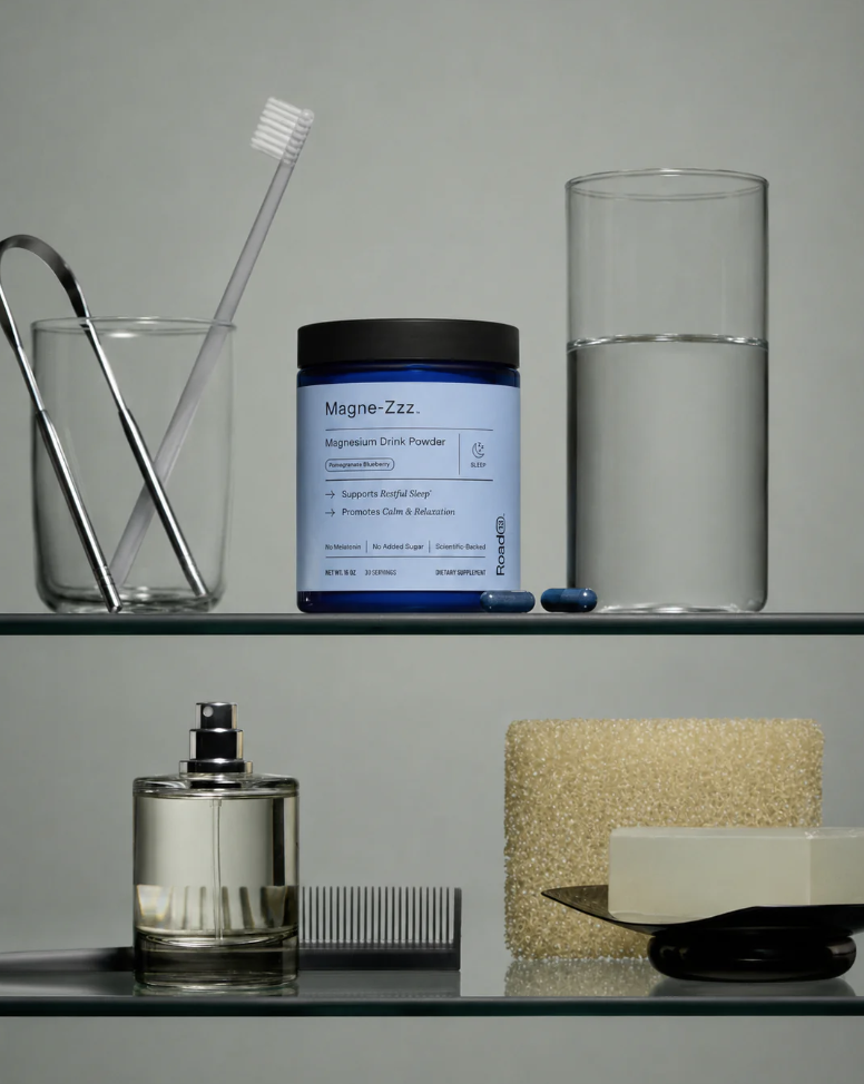
The brand essence, The Effortless Essentialist, became a filter for every decision. We developed a messaging hierarchy rooted in clarity, resilience, and realistic progress, then translated that strategy into a visual identity designed to cut through a category dominated by predictable wellness cues. Color theory led us to Road13’s iconic blue, creating a distinctive visual anchor that carried through the packaging system, Shopify experience, and social presence.
The result is a brand built for more than one product:
A new name and expandable brand architecture centered around thirteen roads to wellness
A clear positioning strategy rooted in a specific, deeply understood customer
A messaging system that makes a complex category easier to navigate
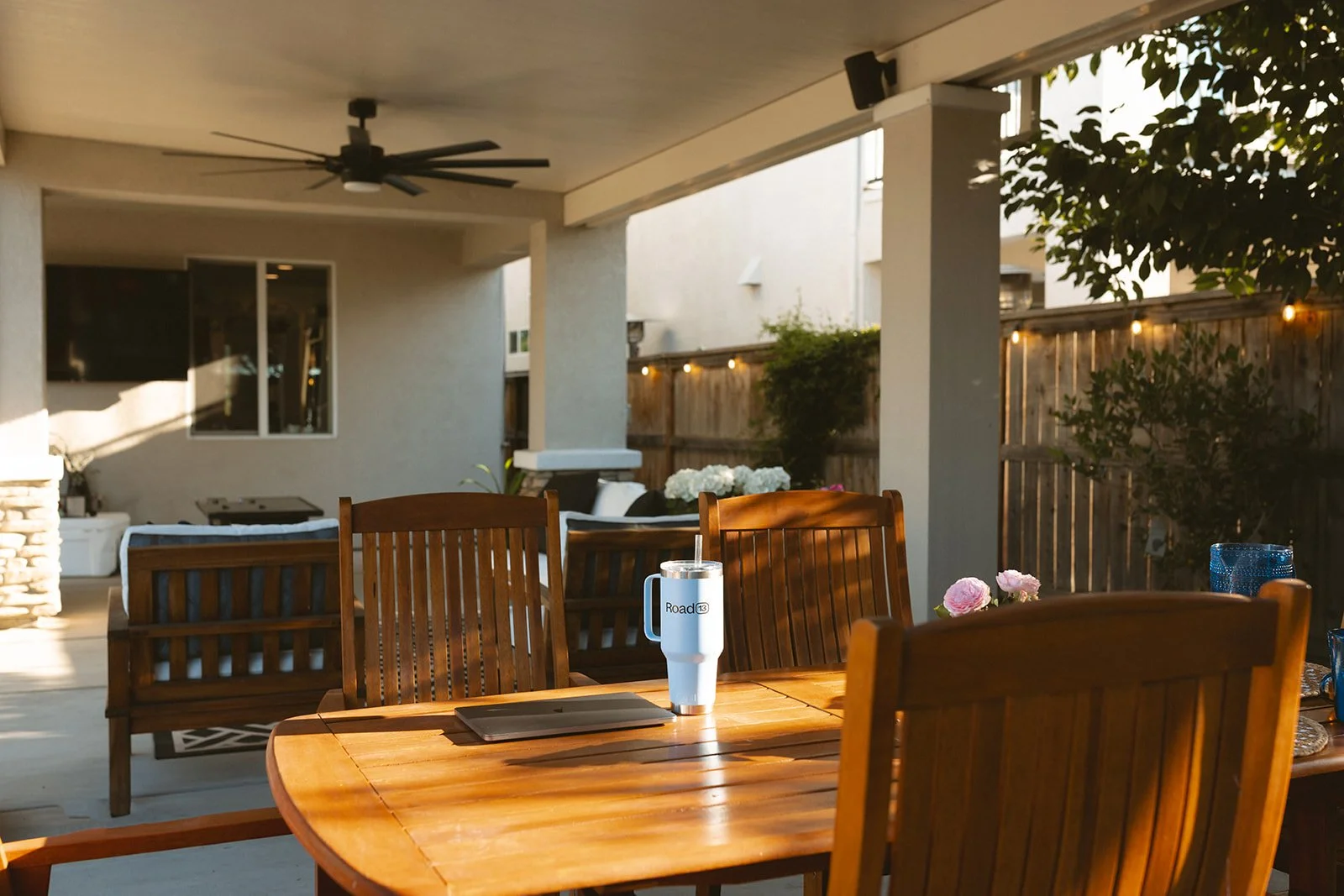
A distinctive visual identity and iconic brand color designed for recognition
A scalable packaging, Shopify, and social system built to grow with the brand
What began as a magnesium powder called Magne-zzz became Road13: an entire brand world designed to cut through the noise and give ambitious people a clearer, simpler path to feeling their best.
Naming
Brand Strategy
Positioning
Messaging
Copywriting
Tagline
Brand Identity Design
Shopify Design and Development
Social Media Design
Packaging
SERVICES